Overview
This project is a case study for the final stage of the Google Data Analysis Course on Coursera. The objective is to analyze data from smart device users to help the high-tech company Bellabeat unlock new growth opportunities. Bellabeat has invested in traditional advertising media such as radio, TV, print, and out-of-home billboards, as well as digital channels like Google Search, Instagram, Facebook, and Twitter.
Company Background
Founded in 2013, Bellabeat is a high-tech company that develops wellness tracking devices specifically for women. By 2016, Bellabeat had launched multiple products and expanded its business globally. These products became available on their own e-commerce platform, as well as through various online retailers. Bellabeat places a strong emphasis on digital marketing, utilizing Google Search, video advertisements, and consumer engagement on social media platforms.
Bellabeat has introduced five products:
- Bellabeat app: This app provides users with health data related to their activity, sleep, stress, menstrual cycle, and mindfulness habits, helping them better understand their current habits and make healthier decisions.
- Leaf: Bellabeat's classic wellness tracker can be worn as a bracelet, necklace, or clip. It connects to the Bellabeat app to monitor activity, sleep, and stress levels.
- Time: This wellness watch combines the timeless look of a classic timepiece with smart technology to track user activity, sleep, and stress. It syncs with the Bellabeat app to provide insights into daily wellness.
- Spring: A smart water bottle that tracks daily water intake to ensure proper hydration throughout the day. It connects to the Bellabeat app to monitor hydration levels.
- Bellabeat membership: A subscription-based program that offers users 24/7 access to personalized guidance on nutrition, activity, sleep, health and beauty, and mindfulness based on their lifestyle and goals.
Project Goals
The company aims to gain insights into how people are using their smart devices. Using this information, I will provide high-level recommendations to inform Bellabeat's marketing strategy.
1. Ask
1.1 What is the problem we are trying to solve?
The problem we are trying to solve is understanding how users interact with their smart devices to identify patterns and trends that can help Bellabeat optimize its marketing strategy and unlock new growth opportunities.
1.2 How can we drive business decisions?
By analyzing smart device usage data, we can identify key insights and trends that inform Bellabeat on user behavior. These insights can guide decisions on targeted advertising, product development, and marketing campaigns across various channels such as radio, TV, print, billboards, and social media platforms like Google Search, Instagram, Facebook, and Twitter.
2. Prepare and Clean
2.1 Data:
Urška Sršen, Bellabeat’s cofounder and Chief Creative Officer, encourages the use of public data that explores smart device users' habits. She points to a specific dataset: FitBit Fitness Tracker Data, which is made available through Mobius on Kaggle and updated annually.
- Data Source: FitBit Fitness Tracker Data (CC0: Public Domain, dataset available through Mobius).
- Data Type: CSV files.
- Data Description: The dataset consists of logs of customer activities, sleep, and other health metrics. Some files are merged, while others (e.g., calorie or sleep data per minute or second) are very large.
- I have 33 participants and 3 Types of data collected over 31 days in 2016:
- Physical: Activity, Intensity, and Steps.
- Physiology: Heart rate, and calories.
- Monitoring: Weight, and Sleep.
- Limited Descriptive: Age, Sex, Career or Life Style.
- Each file of data was explored to know to work with data, columns, data types, names .. etc
2.2 Loading Packages:
install.packages("tidyverse")
install.packages("here")
install.packages("skimr")
install.packages("janitor")
install.packages("lubridate")
install.packages("readr")
install.packages("ggpubr")
library(tidyverse)
library(here)
library(skimr)
library(janitor)
library(lubridate)
library(readr)
library(ggpubr)2.3 Importing data and with names:
dailyActivity <- read.csv(".../dailyActivity_merged.csv")
heartrate <- read.csv(".../heartrate_seconds_merged.csv")
...
weight <- read.csv(".../weightLogInfo_merged.csv")
2.4 Take a look again on data and its structure:
head(dailyActivity)
str(dailyActivity)
...
2.5 Lets check the number of participants in each file:
n_unique(dailyActivity$Id)Output: [1] 33
All datasets have 33 participants each, except for heartrate and weight datasets. Dropped due to small sample size.
2.6 Duplicates :
sum(duplicated(dailyActivity))Output: [1] 0
Drop the duplicated rows:
dailyActivity <- dailyActivity %>% distinct() %>% drop_na()
...
3. Process
3.1 Make Time and Date Same Format:
dailyActivity <- dailyActivity %>%
  rename(date = ActivityDate) %>%
  mutate(date = as_date(date, format = "%m/%d/%Y"))
...
3.2 Merging Data:
daily_activity_sleep <- merge(dailyActivity, sleepDay, by= c("Id", "date"))3.3 Calculate Time in Bed without Sleeping:
daily_activity_sleep$InBedWithoutSleeping <- daily_activity_sleep$TotalTimeInBed - daily_activity_sleep$TotalMinutesAsleep3.4 Average Daily Data:
daily_average <- daily_activity_sleep %>%
  group_by(Id) %>%
  summarise(mean_daily_steps = mean(TotalSteps), ...)
4. Analysis
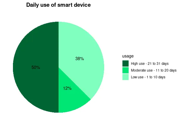
4.1 User Types Distribution:
classify_activity <- function(steps) {
  if (steps < 5000) return("Sedentary")
  else if (steps < 7500) return("Lightly_Active")
  ...
}
Pie chart visualization:
4.2 Average Calories per Hour:
AverageCaloriesPerHour <- hourlyCalories %>%
  mutate(hour = format(date_time, "%H")) %>%
  group_by(hour) %>%
  summarise(avg_calories = mean(Calories, na.rm = TRUE))
4.3 Daily Average Sleep Time and Average Steps:
weekday_steps_sleep <- daily_activity_sleep %>%
  mutate(weekday = weekdays(date)) %>%
  ...
4.4 Smart Devices Usage
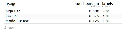
To determine how often users used their smart devices over the 31-day period, we calculated the number of days each user had activity data and sleep data. This helps us understand user engagement levels with the devices.
device_usage_days <- daily_activity_sleep %>%
  group_by(Id) %>%
  summarise(activity_days = n_distinct(date),
            avg_daily_steps = mean(TotalSteps),
            avg_sleep_min = mean(TotalMinutesAsleep))
I also plotted a histogram of the number of active days per user to visualize how frequently users engaged with their devices.
4.5 Correlation
Now, let's examine the correlation between daily steps and calories, as well as between daily steps and sleep.
ggplot(data= subset(daily_activity_sleep,!is.na(TotalMinutesAsleep)),aes(TotalSteps,TotalMinutesAsleep))+
    geom_rug(position= "jitter", size=.08)+
    geom_jitter(alpha= 0.5)+
    geom_smooth(color= "blue", linewidth=.6)+
    stat_cor(method = "pearson", label.x = 15000, label.y = 650)+
    labs(title= "Daily steps vs. sleep", x= "Daily Steps", y= "Minutes Asleep")+
    theme_minimal()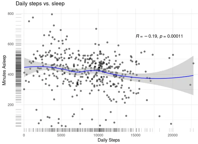
ggplot(daily_activity_sleep,aes(TotalSteps,Calories))+geom_jitter(alpha=.5)+
    geom_rug(position="jitter", linewidth=.08)+
    geom_smooth(linewidth =.6)+
    stat_cor(method = "pearson", label.x = 20000, label.y = 2300)+
    labs(title= "Daily Steps vs. Calories", x= "Daily steps", y="Calories")+
    theme_minimal()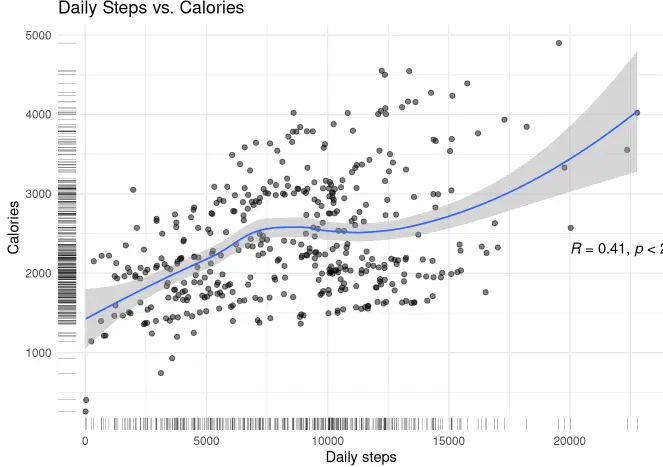
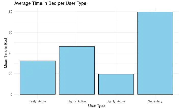
4.6 User Type vs Time in the Bed without Sleeping
I want to see the average TimeInBedWithoutSleep for each user type:
avg_timeInBed_UserType <- daily_average %>%
  group_by(user_type$user_type) %>%
  summarise(mean_time_in_Bed_per_UserType = mean(mean_time_inBed_without_sleep, na.rm = TRUE))

head(avg_timeInBed_UserType)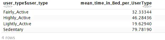
colnames(avg_timeInBed_UserType) <- c("user_type", "mean_time_in_Bed_per_UserType")
ggplot(avg_timeInBed_UserType, aes(x = user_type, y = mean_time_in_Bed_per_UserType)) +
  geom_bar(stat = "identity", fill = "skyblue", color = "black") +
  labs(title = "Average Time in Bed per User Type",
       x = "User Type",
       y = "Mean Time in Bed")+theme_minimal()
5. Share
I used visualizations such as bar graphs and pie charts to make the data easier to understand and accessible to key stakeholders. The analysis was shared through an HTML web report and presentations.
- Pie charts were used to show user type distributions (Sedentary, Lightly Active, etc.).
- Bar graphs showed calorie trends by hour and step/sleep averages per weekday.
- Histograms showed user engagement over the 31-day period.
Visual Summary:
- Active users burn more calories and sleep better than sedentary users.
- Peak calorie burn occurs between 6 PM and 8 PM.
- Step count and sleep duration vary across weekdays, with weekends showing lower activity levels.
- Only a few users used their devices consistently over the month.
6. Act
Based on our analysis, here are our recommendations:
- 💡 Encourage Consistency: Bellabeat can introduce app-based rewards for users who wear their device daily.
- 💡 Targeted Marketing: Focus advertisements on times when users are most active (e.g., evening hours), especially on social platforms.
- 💡 Behavior Insights: Use data patterns (e.g., weekday activity) to deliver personalized tips and reminders via the app.
- 💡 Feature Enhancement: Add notifications for hydration, movement, and sleep to increase device engagement.
- 💡 Community Building: Encourage community challenges or social group activity comparisons through the app to increase motivation.
Future Work:
- Conduct analysis on a larger sample size to generalize the findings.
- Include demographic data (age, lifestyle, occupation) to create more personalized recommendations.
- Analyze trends over longer periods to study changes in behavior over time.
Thank you!
This case study was completed as part of the Google Data Analytics Capstone Project using R and tidyverse packages. All visualizations and code were created by me as part of the learning journey.